
How to Use Colours Like a Designers
How to Use Colours Like a Designer
Color is one of the most essential elements of design. It can create a mood, evoke emotions, and communicate a message. Color can make your plans more visually appealing and engaging when used effectively.
Here are some tips on how to use colors like a designer:
1. Understand color theory.
Color theory is the study of how colors interact with each other. It can help you create color schemes that are harmonious and visually appealing.
Some basic color theory concepts include:
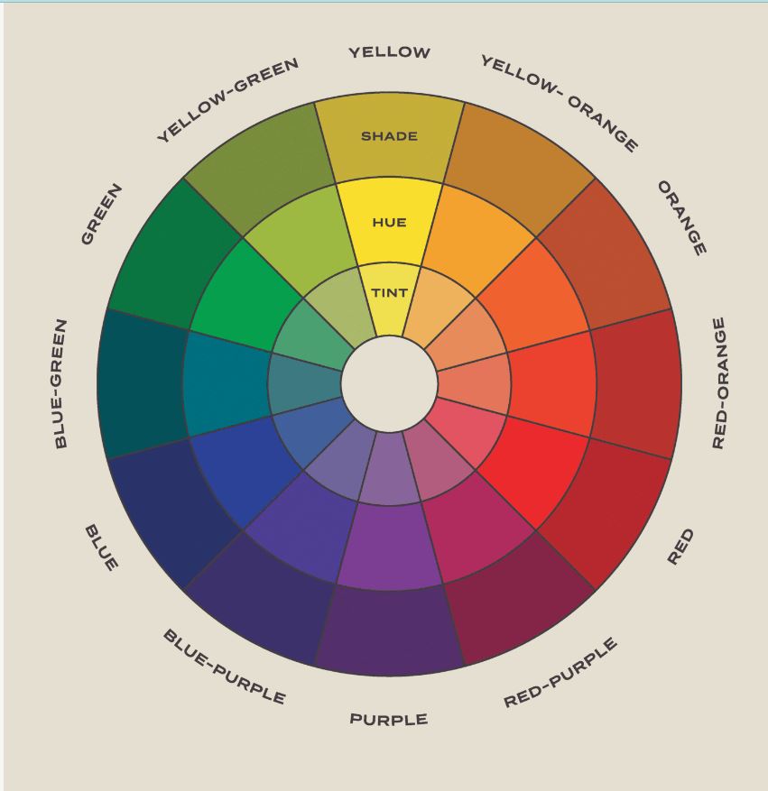
- Hue: The pure color, such as red, yellow, or blue.
- Saturation: The intensity of the color.
- Brightness: The lightness or darkness of the paint.
- Complementary colors: Colors that are opposite each other on the color wheel.
- Analogous colors: Colors next to each other on the color wheel.
- Triadic colors: Colors that are evenly spaced around the color wheel.
2. Choose a color scheme.
A color scheme is a set of colors you will use in your design. It is essential to choose a color scheme that is harmonious and visually appealing. Here are some examples of our design work
Some popular color schemes include:
- Monochromatic: A monochromatic color scheme uses different tints, shades, and tones of the same hue.
- Complementary: A complementary color scheme uses two colors that are opposite each other on the color wheel.
- Analogous: An analogous color scheme uses three colors next to each other on the color wheel.
- Triadic: A triadic color scheme uses three colors evenly spaced around the color wheel.
3. Use color to create a mood.
Different colors can evoke other emotions. For example, red is often associated with excitement and passion, while blue is associated with calmness and peace.
You can use color to create a specific mood in your design by choosing the right colors. For example, if you want to create a calming and relaxing design, you can use blue and green tones.
4. Use color to communicate a message.
Color can also be used to communicate a message. For example, red is often used in marketing materials to grab attention, while blue is often used to convey trustworthiness.
Think about the message you want to communicate with your design and choose colors that will reinforce that message.
5. Use color to create contrast.
Contrast is essential in design because it helps to make elements stand out. You can create contrast by using different colors, values, or textures.
For example, if you have a light-colored background, you can use dark-colored text to make the text stand out. Or, if you have a smooth-textured experience, you can use a rough-textured element to create contrast.
6. Experiment and have fun!
The best way to learn how to use colors effectively is to experiment. Try different color schemes and combinations to see what works best for your design.
And don't be afraid to have fun! Color is a powerful tool that can be used to create truly unique and visually appealing designs.
Here are some additional tips:
- Use color to highlight essential elements. If you have a specific component of your design that you want to highlight, use a contrasting color to make it stand out.
- Use color to create a sense of depth. You can use lighter colors in the background and darker colors in the foreground to make a sense of depth in your design.
- Use color to create balance. It is essential to create balance when using different colors in your design. This means using the right amount of each color so that no one color is overpowering.
- Consider your audience. When choosing colors for your design, it is essential to consider your audience. Different colors have different meanings and associations in different cultures.
Following these tips, you can learn to use colors like a designer and create visually appealing and engaging designs.